CarePortal
Product Designer
June 2022 — November 2024
The Challenge: A Disconnected Experience
When I first started working on CarePortal, the platform was already doing incredible work—connecting child welfare agencies, churches, and community members to meet the needs of vulnerable children and families. But there was a problem: the request experience was fragmented, making it difficult for users to find, collaborate, donate, and take action on requests efficiently.
Requests lived on a static page and map broke everyone of Jacob Nielsen's Design Principles . Users had to jump between different sections to communicate, donate items, or give financially. The checkout process forced them to choose between donating money or items, causing unnecessary friction and drop-offs. On top of that, finding local requests was cumbersome, leaving users frustrated instead of empowered. Something had to change.
The Vision: A One-Stop Request Hub
I envisioned a request page that did more than just display information—it needed to facilitate action. What if users could see a request, communicate in real time, donate seamlessly, and track progress all in one place?
To bring this vision to life, The Team:
- Designed the Request Page as a central hub, integrating an activity feed, donation options, and request details into a single, intuitive layout.
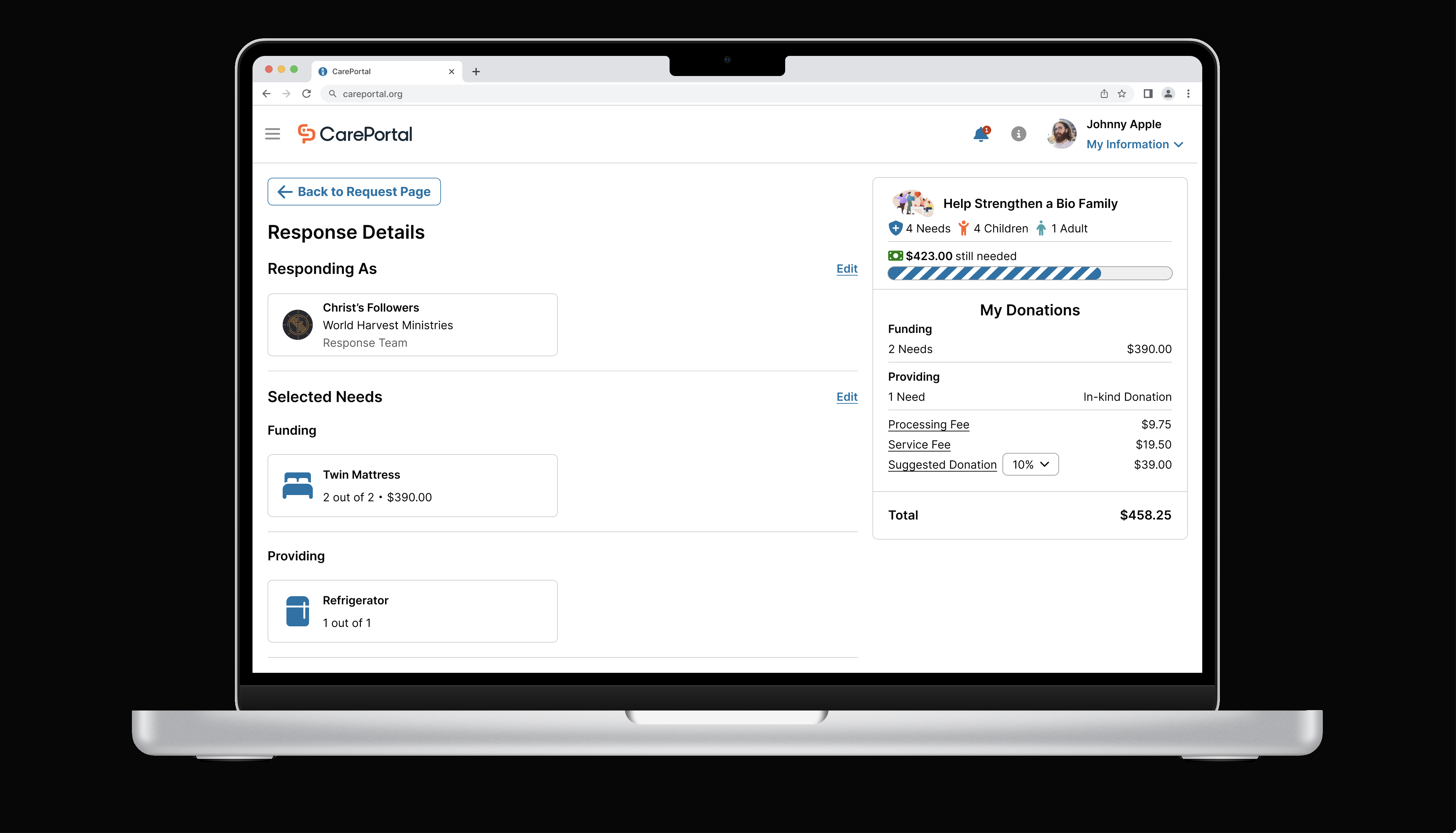
- Redesigned the checkout flow, solving one of CarePortal’s biggest UX challenges—allowing users to donate both money and items in the same transaction instead of forcing separate processes.
- Gave the user 4 different views including an interactive map feature, making it easy for users to find and filter requests in their area based on urgency, location, and type of need.
- Facilitated design sprints and stakeholder workshops, ensuring alignment between product managers, developers, and end-users at every step.
- Prioritized accessibility, implementing WCAG-compliant design patterns to create an inclusive experience for all users.
The Impact: A More Engaging and Effective Platform
Through iteration and user testing, we saw the transformation take shape:
Increased engagement—users were more likely to interact with requests and communicate in the activity feed.
Higher donation conversions—a streamlined checkout experience reduced friction, leading to more completed transactions.
Better request visibility—the interactive map made it easier for users to support local needs.
Stronger stakeholder alignment—by leading design sprints, we cut through misalignment and moved faster toward meaningful solutions.
In 2024, We Helped 95,281 Children.
This number isn’t just a statistic—it’s real children given a bed to sleep in, a warm meal, or the support their family desperately needed. Through thoughtful UX and a commitment to accessibility, we helped bridge the gap between those in need and those willing to help—turning good intentions into meaningful action.
Final Thoughts
This project reminded me that great UX isn't just about aesthetics—it's about removing barriers so people can make a real impact. By listening to users, aligning stakeholders, and iterating with purpose, we turned a fragmented experience into an intuitive, action-driven platform that empowers people to help their communities.


